 ← Projects
SafeBite
Turning complicated food information into a calmer decision.
- Role
- Product designer & front-end prototyper
- Timeline
- Concept project · 2025
- Team
- Independent project
Make the information easier to question
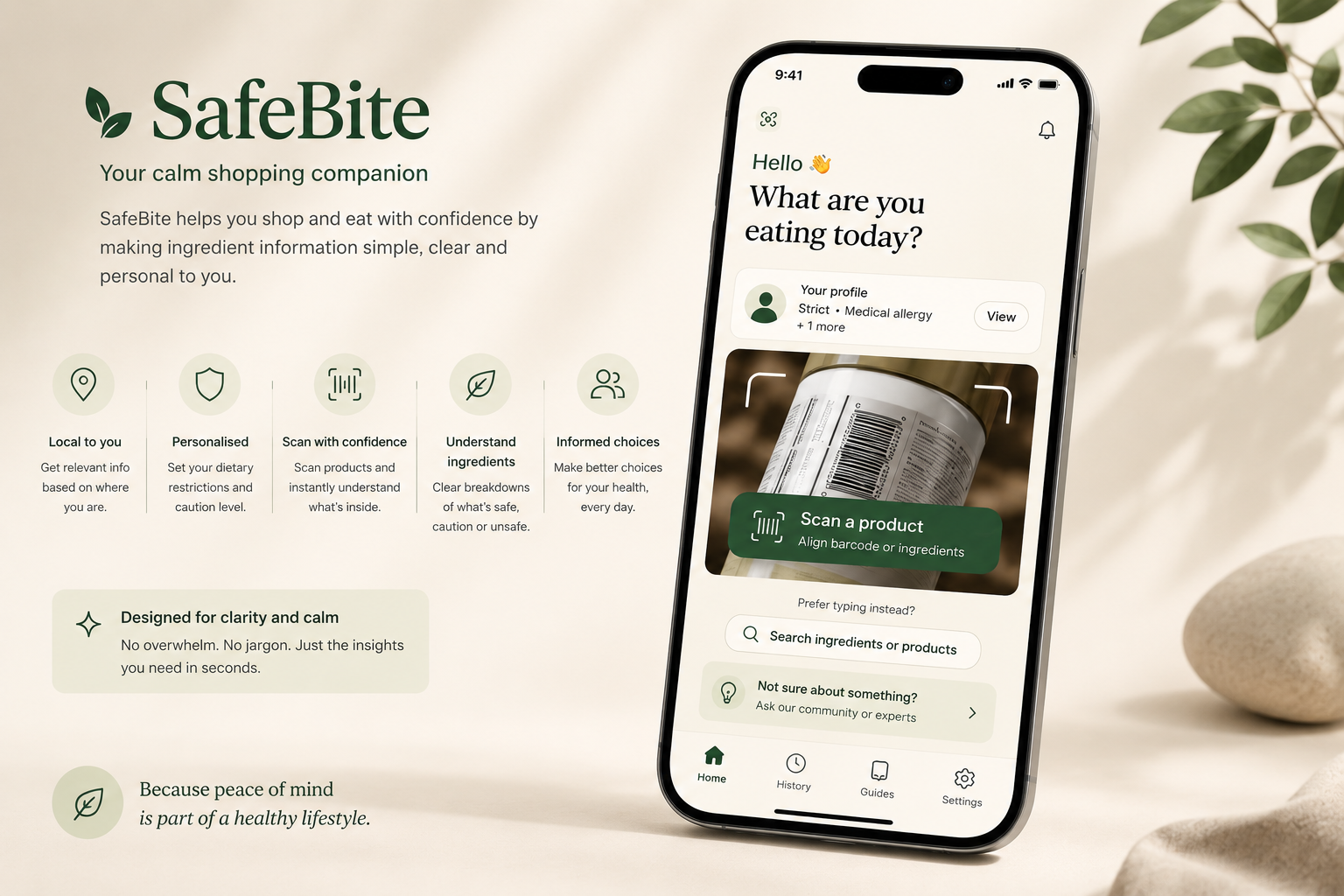
SafeBite is a food-information concept about reading order. Ingredient lists, dietary information and explanations can all be present on a screen without making the next decision clear.
The project explores a layered interface: surface relevant information first, explain what it means, then let someone inspect the detail. The goal is comprehension. It is not a validated system for declaring a food safe to eat.
One label, several different questions
Someone checking an ingredient has a different immediate question from someone comparing nutrition. A single score or prominent verdict risks flattening those needs into one answer.
The design therefore treats warnings, general information and optional explanation as different layers. They need distinct labels and a predictable reading order, so urgency does not depend on noticing a colour alone.
A three-level reading hierarchy
The first layer helps the reader locate the information relevant to their question. The second gives a short, plain-language explanation. The third retains the underlying product detail for checking and comparison.
Progressive disclosure is useful only if it does not hide consequential information. The interaction needs to keep important limitations visible while allowing secondary explanations to expand without overwhelming the initial view.
Design for uncertainty as well as answers
The concept needs a meaningful state when product information is incomplete, a term is ambiguous or the source cannot be verified. An attractive summary should not make missing information look settled.
This makes wording part of the design work. The interface should distinguish what the source says from what the product interprets, and avoid presenting an explanation as an individual medical recommendation.
Where the concept stands
SafeBite presents an approach to information hierarchy, not evidence of clinical safety or improved decision-making. Its contribution is a more deliberate structure for reading complex product information.
Before making outcome claims, the next work is to validate the content with appropriate expertise and evaluate the interface with people who have different dietary needs. The important question is whether they understand both the information and its limits.
Useful information should lower the temperature of a decision.